In
my blog journeys I have come to seek
out other Interior designer on a greater scale in effort to broaden my horizon and along
the way I've discovered some amazing designers. One designer that I've been following is Tom Stringer
I have learned that his designs are clean, fresh and his use of space is
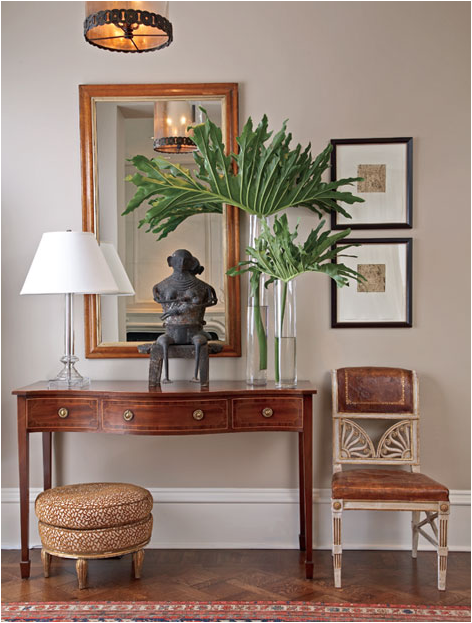
incredible I love all the symmetry, proportion and balance he brings to his
designs. All his designs are easily navigated and No space is overly designed
and all spaces are comfortably livable. I just love his non expected use of
color. Just looking at how he hang art is something to admire. Can you imagine trying to hang a picture
straight? I’ve tried and I’ll tell you it’s not easy. Tom can teach us a thing
or two about balance, When I first noticed his work I was very impressed by his
use of all design terms we learned in Interior design school, the scale of his
work is right on point and nothing less. Thanks Tom for your amazing designs.
If you will like to learn more about Tom Stringer check out the source button at the bottom of the page.
Tell me what you think!!! Was Tom Stringer a Great Weekly Interior Designer Moment?
 |
| Tom Stringer Design Partners |


2 comments:
Great designs, great symmetry! Love all of the hanging photographs, the chair in the 2nd shot, the chandelier in the 3rd...all great designs. -Kristy
Kristy I have to agree with you that the chair in the second shot is off the chain just the balance of how its sitting under the photographs amazing how he balances everything out. Oh by the way I knew that a great photographer will appreciate this interior designer moment. Thanks for your comment.
Post a Comment